Persons, Collections and Topics
Colored and uncolored images in 16th–17th-century plant books
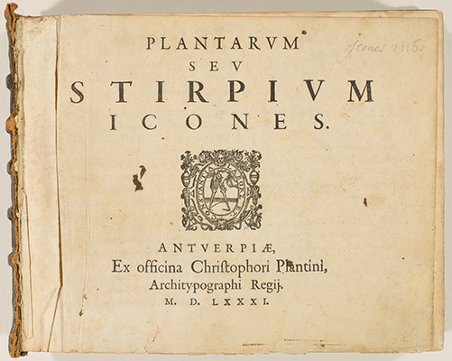
A previous owner colored some of the images in Hunt Institute's copy of Matthias de L'Obel's Plantarum seu Stirpium Icones (Antwerp, Christophe Plantin, 1581). Based on the method of coloring, especially in the areas where the coloring was most sophisticated, we assume that this was a modern owner. While the quality of the coloring was poor in the majority of images, in some it was quite beautifully done and substantially changed the impact of the illustrations from an aesthetic perspective.
In our historical book collection most works have no illustrations, and, of those that do, most illustrations are uncolored. Among the colored works, some were issued that way by the publisher, others were colored by someone hired by the book owner, and still others were colored by the owners themselves. Thus the quality of coloring in these older books varies greatly. However, one might ask, why color the illustrations at all?
Humans are attracted to color. Images are colored to make them more beautiful or appealing, to make them look more as they do in real life and to convey important information about what the images represent. Coloring, when done well, can make the image seem to mimic the real thing and to come alive, greatly enhancing the function and meaning of the work as well as its aesthetic appeal and perceived value. However, coloring is not always an improvement. Bad coloring can make an image seem less life-like than the uncolored version, and even good coloring can obscure information in the image by covering over and distracting from the original line work and details.
Until color printing methods were developed to the point where they could be economically viable for entire print runs of books, adding color meant coloring by hand. Authors had to consider whether this was a good choice, balancing color against possibly shrinking the size of the audience to those who could afford an expensive book with colored images. For the publisher, coloring was an extra cost on top of that needed for woodblocks or engravings, but then again, coloring every image meant being able to charge for deluxe copies while leaving the images uncolored meant lower prices and more copies sold. Often this was resolved by having two print runs. Naturally, how well the deluxe copies were colored also determined how much the publisher would be able to charge for them and how well they would sell.
Publishers like Christoph Plantin (ca.1520–1589) understood that in the 16th century it was essential for a successful herbal not only to be illustrated but also to be well illustrated, which meant detailed and expertly made woodcuts, drawn from life whenever possible. However, it would have been extremely expensive to add realistic coloring to those expectations, given the costs, the technical challenges and the increasing size of herbals packed with new information and images. Exactly reproducing natural coloration was difficult, and until technical developments allowed for standardized pigments, there was no way to guarantee that paint of a particular color could be duplicated. Given all of these factors, it is not difficult to see why so many herbals and botanical works of the 16th and 17th centuries were left uncolored.
References
Backer, W. de, F. de Nave and D. Imhof. 1993. Botany in the Low Countries (End of the 15th Century–ca.1650). Antwerp: The Plantin-Moretus Museum and The Stedelijk Prentenkabinet.
Nickelsen, K. 2006. Draughtsmen, Botanists and Nature. Dordrecht: Springer.
Stallybrass, P. 2015. Paint over Print: Hand-Colored Books and Maps of the Early Modern Period. University of Pennsylvania. https://youtu.be/r4DqImNj6js.

![<p><em>From left</em>, Arantia and Pomum Assyrium [<em>Citrus aurantium</em> Linnaeus and <em>Citrus medica</em> Linnaeus, Rutaceae], hand-colored (by a previous owner) and uncolored woodcuts by an unknown engraver after originals likely by Pieter van der Borcht (1545–1608) for Matthias de L'Obel (1538–1616), <em>Plantarum seu Stirpium Icones</em> (Antwerp, Christophe Plantin, 1581, Tomus secundus, p. 144), HI Library call no. DQ1 L797P RR.</p>](/admin/uploads/hibd-plantarum-arantia-0144.jpg)
![<p><em>From left</em>, Mespilus and Mespilus domestica [<em>Mespilus germanica</em> Linnaeus, Rosaceae], hand-colored (by a previous owner) woodcuts by an unknown engraver after originals likely by Pieter van der Borcht (1545–1608) for Matthias de L'Obel (1538–1616), <em>Plantarum seu Stirpium Icones</em> (Antwerp, Christophe Plantin, 1581, Tomus secundus, p. 166), HI Library call no. DQ1 L797P RR.</p>](/admin/uploads/hibd-plantarum-mespilus-0166.jpg)
![<p><em>From left</em>, Nux Iuglans and Zizipha candida Monspelliensium, perperam Sycomorus Venetorum & Italorum [<em>Juglans</em> Linnaeus, Juglandaceae; <em>Ziziphus</em> Miller, Rhamnaceae], hand-colored (by a previous owner) and uncolored woodcuts by an unknown engraver after originals likely by Pieter van der Borcht (1545–1608) for Matthias de L'Obel (1538–1616), <em>Plantarum seu Stirpium Icones</em> (Antwerp, Christophe Plantin, 1581, Tomus secundus, p. 108), HI Library call no. DQ1 L797P RR.</p>](/admin/uploads/hibd-plantarum-nux-0108.jpg)
![<p><em>From left</em>, Rosa canina (with Rose bedeguar gall), Rosa sylvestris, Rosa sylvestris odorata and Rosa silvestris pomifera [<em>Rosa canina</em> Linnaeus, <em>Rosa</em> Linnaeus and ?<em>Rosa villosa</em> Linnaeus, Rosaceae], hand-colored (by a previous owner) woodcuts by an unknown engraver after originals likely by Pieter van der Borcht (1545–1608) for Matthias de L'Obel (1538–1616), <em>Plantarum seu Stirpium Icones</em> (Antwerp, Christophe Plantin, 1581, Tomus secundus, pp. 210–211), HI Library call no. DQ1 L797P RR.</p>](/admin/uploads/hibd-plantarum-rosa-0210.jpg)
![<p><em>From left</em>, Rubus Idaeus and Erica pumila calyculato Vnedonis flore [<em>Rubus idaeus</em> Linnaeus, Rosaceae; <em>Erica pumila</em> Andrews, Ericaceae], hand-colored (by a previous owner) and uncolored woodcuts by an unknown engraver after originals likely by Pieter van der Borcht (1545–1608) for Matthias de L'Obel (1538–1616), <em>Plantarum seu Stirpium Icones</em> (Antwerp, Christophe Plantin, 1581, Tomus secundus, p. 212), HI Library call no. DQ1 L797P RR.</p>](/admin/uploads/hibd-plantarum-rubus-0212.jpg)
![<p><em>From left</em>, Sycomorus and Ficus [<em>Ficus</em> Linnaeus, Moraceae], hand-colored (by a previous owner) woodcuts by an unknown engraver after originals likely by Pieter van der Borcht (1545–1608) for Matthias de L'Obel (1538–1616), <em>Plantarum seu Stirpium Icones</em> (Antwerp, Christophe Plantin, 1581, Tomus secundus, p. 197), HI Library call no. DQ1 L797P RR.</p>](/admin/uploads/hibd-plantarum-sycomorus-0197.jpg)
